This is part of a series of posts about writing good components
Today, let’s talk about the Avatar component.
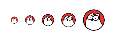
<Avatar image="simons-cat.png" />Avatars are spread across every application, and usually come in different sizes as well. You need a large on for the user profile, a tiny one in dropdowns and few in between.
That’s fair, let’s add a size prop.
We don’t want to open it up completely by accepting width and height, instead we want to give the developer enough options to satisfy all their use cases.
<Avatar size="xsmall" image="simons-cat.png" />
<Avatar size="small"  image="simons-cat.png" />
<Avatar size="medium" image="simons-cat.png" />
<Avatar size="large"  image="simons-cat.png" />
<Avatar size="xlarge" image="simons-cat.png" />
In cosmos, we also have avatars for applications. We want them to look slightly different - rounded square instead of circle.
Part of creating a good API is to make your developers think about the data not the design - the design is baked into the component
We can add another prop differentiate between the two types. One little prop can’t hurt, right?
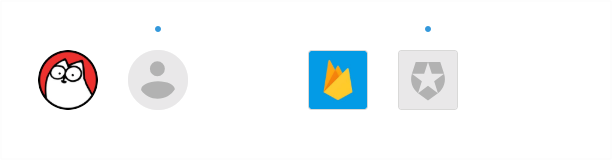
<Avatar type="user" image="simons-cat.png" />
<Avatar type="app"  image="firebase.png" />
Looks good, right?
Oh and we get multiple sizes support for the application avatar because it’s the same component. We don’t really need them, but it’s free 🤷
<Avatar type="app" size="xsmall" image="firebase.png" />
<Avatar type="app" size="small"  image="firebase.png" />
<Avatar type="app" size="medium" image="firebase.png" />
<Avatar type="app" size="large"  image="firebase.png" />
<Avatar type="app" size="xlarge" image="firebase.png" />
Let’s talk about how a developer would actually use this component in their application. The user information probably comes from an API and contains the avatar url. They pass this to the Avatar component using props.
And if the user has not uploaded an avatar yet, we wan’t to show a nice default instead, same goes for the application logo.
<Avatar type="user" image={props.user.avatar}  />
<Avatar type="user" image={missing} />
<Avatar type="app"  image={props.app.logo}     />
<Avatar type="app"  image={missing}  />
This default is baked into the component as well, we don’t ask the developer for an image.
That’s a good fallback, but we can do better.
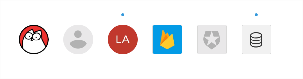
In the case of a user, we can show the initials of their name with a unique background (Gmail made this pattern popular, it helps differentiate between people with a quick glance)
For an application, we can communicate the type of application with an icon. This also helps identifying applications with a quick glance.
<Avatar type="user" image={props.user.avatar} />
<Avatar type="user" image={missing} />
<Avatar type="user" initials={props.user.intials} image={missing} />
<Avatar type="app"  image={props.app.logo} />
<Avatar type="app"  image={missing} />
<Avatar type="app"  icon={props.app.type} image={missing} />
Let’s look at all the props our component supports now:
| name | description | type | default |
|---|---|---|---|
image |
an image URL | string |
- |
size |
size of avatar | string: one of [xsmall, small, medium, large, xlarge] |
small |
type |
type of item represented by the avatar | string: one of [user, app] |
user |
initials |
initials of the user as fallback | string |
- |
icon |
an icon to display as fallback | string: one of [list of icons] |
- |
We started with a simple avatar component, but now it supports all these props and behaviour!
When you see a component that supports a lot of props, it’s probably trying to do too many things. You my friend have created the Apropcalypse.
All credit for coming up with this clever name goes to Jenn Creighton.
With our Avatar component, we’re trying to make it work for users and applications with multiple sizes and different types of fallbacks.
This also allows weird combinations that aren’t recommended like an application avatar with text fallback. Remember, that was tip #1 of this series!
Alright, how do we clean this up? Create two different components.
Here’s the tip to remember from this post:
Don’t be afraid to create a new component rather than adding props and additional logic to a component.
First, here’s what the API would look like for 2 different avatar components:
<UserAvatar size="large" image="simons-cat.png" />
<UserAvatar size="large" image="" />
<UserAvatar size="large" fallback="LA" image="" />

<AppAvatar image="firebase.png" />
<AppAvatar image="" />
<AppAvatar fallback="database" image="" />
There are a few things to notice in the API:
-
We were able to remove unwanted features like
sizeon theAppAvatar. -
We reduced the surface area of our API by keeping the name of the
fallbackprop consistent across the two components.Remember tip #2 of this series? We want developers to think of the behaviour (fallback) not the interaction/implementation (initials or icon). This helps developers quickly learn the API and how to use the components.
-
We are also able to avoid any conflicting props.
-
Lastly, we reduced the number of props. Look at the table of props now, it’s much cleaner:
UserAvatar
| name | description | type | default |
|---|---|---|---|
image |
an image URL | string |
- |
size |
size of avatar | string: one of [xsmall, small, medium, large, xlarge] |
small |
fallback |
initials of the user as fallback | string |
- |
AppAvatar
| name | description | type | default |
|---|---|---|---|
image |
an image URL | string |
- |
fallback |
an icon to display as fallback | string: one of [list of icons] |
- |
The only thing that bugs me a tiny bit about this API is that even though both the components have the same name and type for the fallback prop fallback:string, one of them is takes two letters for initials while the other takes the name of an icon.
Made it this far? Great! Here’s some bonus content.
Let’s talk about the implementation for a second. It’s tempting to create a BaseAvatar component that both UserAvatar and AppAvatar use with some props locked down.
function UserAvatar(props) {
  return (
    <BaseAvatar
      image={props.image}
      type="user"      initials={props.fallback}    />
  )
}
render(<UserAvatar fallback="LA" />)
And that’s not a bad idea at all. But it’s really difficult to anticipate on the first day. We’re really bad at predicting future requirements.
Start with two different components and as they evolve, you might start seeing similar patterns and find a nice abstraction. Having no abstraction is far better than having the wrong abstraction.
Prefer duplication over the wrong abstraction - Sandi Metz
Go back to your codebase and find that component that accepts too many props and see if it can be simplified by splitting into multiple components.
Hope that was helpful on your journey
Sid
Further reading
- Previous posts from this series about writing good components.
- Jenn Creighton’s talk where she introduced the Apropcalypse
- Sandi Metz’s talk about duplication and abstractions