One of the first projects I did at codesandbox was to improve the theming system. CodeSandbox supports a bunch of vscode themes out of the box + you can drop the contents of any theme as well.
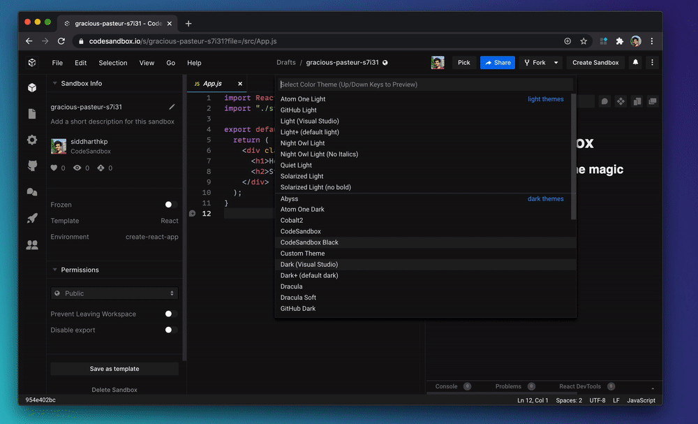
This makes sense because codesandbox uses VSCode for the editor, so you should be able to replicate your local setup. However, there are parts of the page that aren’t coming from VSCode, including some UI elements that don’t exist in VSCode.
To make sure all components adapt to theme, we extend the editor theme to fill in for rest of the interface. This works for the most part, but comes with it’s challenges.
A theme that looks good on the editor, might not look good in codesandbox - for example, Night Owl which is a soft theme, it works great in the editor part but is too low contrast for a web interface. Cobalt2 on the other hand has a strong accent color which makes the UI look a bit too funky.
The goal here is to make our custom components adapt to any vscode theme and look good in codesandbox.
0. Theme provider
First up, we use ThemeProvider with styled-components so that you can change the theme at the top level and it trickles down to all the components. This is fairly common practice.
1. Derived primitives
There are UI components that you don’t see in code editors but are common in interfaces like, avatars, toggles, etc. Icon-buttons from VSCode aren’t how you would show clickable buttons in a web application.
To adapt the theme for these components, we “derive” styles based on other properties of the theme.
For example: The avatar is used in the sidebar, so we use sideBar.border as the avatar.border. Similar story for switch/toggle.
We colocate all these decisions in a layer built on top of the theme, so that we can keep them together and components can safely assume that corresponding theme keys always exist.
const derivedTheme = {
  ...

  avatar: {
    border: theme.sideBar.border
  },
  switch: {
    backgroundOff: theme.input.background,
    backgroundOn: theme.button.background,
    toggle: designLanguage.colors.white,
  }

}
const Avatar = styled.img(({ theme }) => ({
height: 32,
width: 32,
border: '1px solid',
borderColor: theme.avatar.border}))
Another example is subtle text.
While VSCode allows you to define what text colors look like in different parts of the theme, it doesn’t promote hierarchy or consistency, that’s completely upto the theme developer.
Don’t get me wrong, this flexibility is great as a theme developer. But, as you can imagine, a user interface without hierarchy or consistency wouldn’t look great. We take the liberty of picking one text style as the source of truth and then use that everywhere else.
const derivedTheme = {
  ...

  subtleText: theme.input.placeholderForeground

}
This might look like a vague guesstimate, and it honestly is. 😅
I picked the key that is closest to what we need, and then we tweak it for legibility based on the theme.
2. Tweaking for legibility
Derived styles work great for the most part. But, when everything is dynamic, it’s hard to ensure the editor styles would extend well to other parts of the UI, even for the most well defined themes.
One such example is Night Owl. I’m a fan of the theme and a bigger fan of the author of the theme. However, when we extend it beyond it’s intended use, we end up with text that’s has low contrast.
To overcome this, we modify the theme on runtime!
When you change the theme, it goes through a series of color contrast checks to make sure text is readable.
import ensureContrast from './contrast'

// ensure contrast of foreground on background
derivedTheme.subtleText = ensureContrast({
  foreground: theme.subtleText,
  background: theme.sideBar.background,
  themeType: theme.type
})

derivedTheme.activityBar.selectedForeground = ensureContrast({
  foreground: theme.activityBar.selectedForeground,
  background: theme.activityBar.inactiveForeground,
  themeType: theme.type
})
/* contrast.js */
import Color from 'color'
// WCAG 2.0 level AA
const minimumContrast = 4.5
const lighten = color => Color(color).lighten(0.1).hex();
const darken = color => Color(color).darken(0.1).hex();
const ensureContrast = ({ foreground, background, themeType }) => {
const contrast = Color(foreground).contrast(Color(background))
// if there's enough contrast, return color
if (contrast > minimumContrast) return foreground
// infinite loop check:
// if color is already at the one of the extremes, give up
if (color === '#FFFFFF' || color === '#000000') return foreground
// choose contrast function based on theme type - light or dark
let increaseContrast
if (themeType === 'light') increaseContrast = darken
else increaseContrast = lighten
// recursively increase contrast until it's good
return withContrast(increaseContrast(foreground), background)
}
Not shown in the example above, the miniumum contrast depends on the content. According to Web Content Accessibility Guidelines (WCAG), text should have a minimum contrast ratio of at least 4.5 : 1 and icons should have a minimum ratio of 1.6 : 1
And, that will do it.
If you’re curious, the code for this is open source and you can see the entire function.