UPDATE: Shout out to my friend Andres who helped me improve this article. He pointed out that animating
positionproduces a repaint on every keyframe and usingtranslationis way more performant. You should follow Andres on twitter, he’s a CSS wizard.
Hi!
For my course on React Hooks, I have to make a bunch of animations for it to be interesting.

A few folks asked how do those animations work…
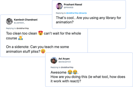
You’ll be surprised at how easy it is with CSS.
First, let’s break down our composition:
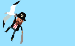
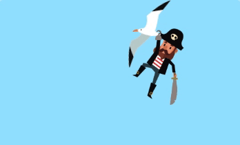
- We have a bird and a pirate that’s hanging from the bird
- They enter together from the right side of the screen
- After reaching half way, the bird drops the pirate and leaves the screen from the left
- The pirate falls to the bottom of the screen
Step #1: Characters

<div class="bird"></div>
<div class="pirate"></div>
.bird {
background-image: url('./bird.png');
}
.pirate {
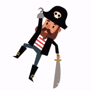
background-image: url('./pirate-hanging.png');
}With some hit and trial, we can position the pirate at exactly the right spot.
.pirate {
  top: 27px;
  margin-left: 49px;
}
We need another image for the pirate in his falling state. Because the image is a vector image (SVG), we can modify it to get the right posture. (I used sketch, but you do this in any image editor)
Okay, now that we have the graphics ready, let’s think about the choreography.
Step #2: Choreography
Before we write any code, it’s useful to write down the different steps of the animation.
t = 0     1     2     3     4     5         6     7     8     9
    ←---------  enter  --------⇥  ←  pause ⇥  ←----- exit ----⇥

1: 0s - 5s : bird: fly in + pirate: fly in
2: 5s - 6s : pause
3: 6s - 9s : bird: fly out + pirate: fall
Let’s start with the bird flying in.
We want the bird to come in from outside the screen to the middle. We can attach the same animation to the pirate because he is hanging to the bird for this part.

.bird {
  animation: bird-enter 5s ease-out;
}
.pirate {
  animation: bird-enter 5s ease-out;
}

@keyframes bird-enter {
  from {
    /* right end of the screen */
    transform: translateX(100vw);
  }
  to {
    /* half way */
    transform: translateX(50vw);
  }
}
Looking good!
By default, the characters will reposition snap to their default position after the animation is finished. That’s because CSS animations do not affect the element before the first keyframe is played or after the last keyframe is played.
We can use the property animation-fill-mode to override this behavior:
.bird .pirate {
  animation-fill-mode: forwards;
}
forwards will make the element stay in the same position as the final keyframe.
Alright, let’s talk about the exit.
An element can have multiple animations applied to it.
.bird {
  /*         ↓ enter animation       ↓ exit animation   */
  animation: bird-enter 5s ease-out, bird-exit 3s ease-in;
}
Both of these animations will start at the same time though. That’s not good, we want the second animation (exit) to start some time after the first animation finishes (enter).
This is where the animation-delay property comes in. The delay for the exit animation should be the duration of the first animation + the pause we want to take between animations: 5 + 1 = 6s.
Because we have multiple animations, we need to specify the delay for each of the animation.

.bird {
  /*         ↓ enter animation       ↓ exit animation   */
  animation: bird-enter 5s ease-out, bird-exit 3s ease-in;
  animation-delay: 0s, 6s;
  /* 0s delay for the entry animation, 6s for the exit  */
}

@keyframes bird-exit {
  from {
    transform: translateX(50vw);
  }
  to {
    /* exit outside the frame */
    transform: translateX(-10vw);
  }
}
Sidenote: you can also write the above code with the animation shorthand, where the 4th argument is delay: bird-exit 3s ease-in 6s.
Okay, now let’s talk about the pirate’s exit. The timing is the same as the bird, but the animation is a little different. We want the pirate to fall down from it’s original position to the bottom end of the screen.
.pirate {
  /*         ↓ enter animation       ↓ exit animation   */
  animation: bird-enter 5s ease-out, fall 3s ease-in;
  animation-delay: 0s, 6s;
  /* 0s delay for the entry animation, 6s for the exit  */
}

@keyframes fall {
  from {
    /* keep it's X position */
    transform: translateX(50vw);
  }
  to {
    /* keep X position, fall to the bottom end of the screen */
    transform: translateX(50vw) translateY(100vw);
  }
}
Okay that’s a good start, but we also need to change the image.
We can attach a different class to the pirate element with javascript to have a different background image. But, we can also achieve this through css.
If we supply the new background-image to the element in the from and to of the animation, it will apply it for the whole duration.
To make the effect even better, let’s rotate the pirate while he falls.
@keyframes fall {
  from {
    /* keep it's X position */
    transform: translateX(50vw);
    background-image: url('./pirate-falling.png') rotate(0deg);
  }
  to {
    /* keep X position, fall to the bottom end of the screen */
    transform: translateX(50vw) translateY(100vw) rotate(90deg);
    background-image: url('./pirate-falling.png');
  }
}
This is the combined result:

If we use the SVG version of the pirate instead of PNG, we can go really deep and animate each part of the pirate. Something like:
.pirate .hand {
  animation: raise-up 2s ease-in;
}
We don’t have to, of course. A few lines of CSS keyframes combined together gave a pretty good result too!
If you want to experiment, here’s a codepen link to this animation.
Hope that was useful on your journey
Sid