You probably don’t work in a fortune 500 company with dozens of developers and designers working on a design system. Neither do I.
The rest of us can benefit greatly from them as well, we just have to pick our battles wisely.
What’s a design system, you ask?
A Design System is the single source of truth which groups all the elements that will allow the teams to design, realize and develop a product.
It’s NOT just a component library, here are all the things you need to think about while building a design system:
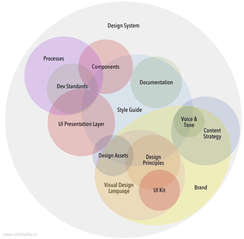
You need all of these to build a complete design system, but I think you can get really far with just a few of these.
I call this Adoption driven development.
Our strategy has been to first systemise design decisions in products and then change them. For version 1, we focused on adoption - getting the system into products and into production without changing the design too much.
In the design system team, we call this our Trojan horse.

Once we’re in, we can start creating all kinds of havoc. Change a color or font-size and it spreads across the products.
It’s a little frustrating because you’re absorbing bad decisions as well (like a color that’s not accessible) but the goal of the system is not to make everything perfect, it’s to make everything consistent.
Short term goal: Consistency
Long term goals: Quality and Productivity.
From the big Venn diagram, we picked the following: Tokens, components, design assets, documentation.
1. Tokens
Tokens are values that should span across your products. Things like brand color is easy, but standardizing values like error text color and shadow depth will instantly give a feel of consistency across screens.
In fact, if you had to pick just one thing, pick tokens.
The great part apart tokens is that your technology stack doesn’t impact these. You can write them for one stack in mind and port them for everything else.
We picked json as our base because the component library uses css-in-js, but we export them as css and stylus variables, even xml for the android folks.
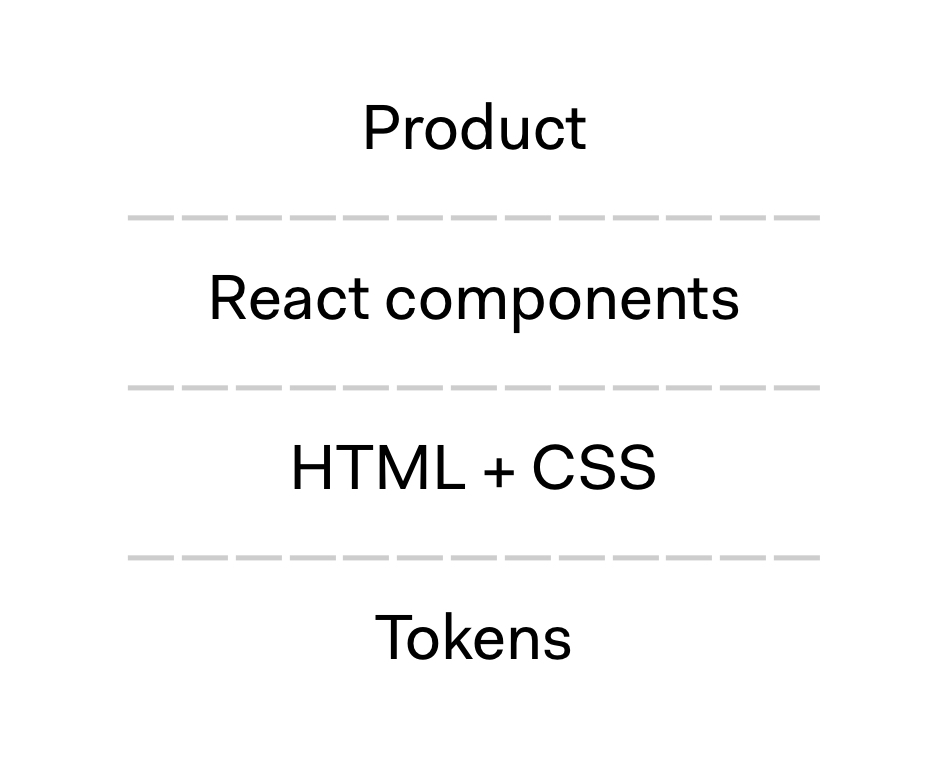
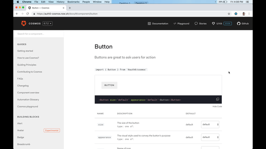
2. Components
Components are what your users (developers using the system) care about 99% of the time, getting the API right is the most important thing here. You can refactor everything underneath if you need to and your users won’t notice.
We started with a component library written in React using styled-components (a CSS-in-JS library) - a big no-no in the design system world.
Nothing against React and styled-components of course, but this solution is too high up the abstraction layers of the web.
What if the next product is built with Vue JS or any other framework, you’re toast. And what about that legacy jquery app that all of us lying around, is that just not-supported by the system?
It’s common wisdom to start with a lower abstraction, plain old html with css classes that everyone can use - no matter the framework. Make sure the output of your React components look the same and we’re good!
Now, of course, you can still create a component library with React that only the products with React use, this library takes the responsibility of using the right CSS classes and HTML structure.
The ideal abstraction layers look like this:
As a team of 3, it would have taken us forever to get all those pieces right. So we built only the React component library.
Good news: That’s what our first users cared about anyways, we can move to the ideal structure whenever we want. We were able to prove the success of the system with the flagship product and now other’s want in as well.
Adoption driven development!
Bad news: The marketing team wants to use the system (HTML + CSS pages), but we can only give them our tokens for now until we build that middle abstraction layer.
We knew that our approach will slow down our long term goals for the benefit of short term goals, and that’s okay.
3. Design assets
The goal of a design system is to bring consistency and you can’t do that unless both designers + developers use the system.
Easy to do: Tokens. Instead of picking a new color or spacing every time, you pick from the already documented one.
Harder to do: Components. When everyone uses the same component name with the same props/overrides, communicating design specs becomes way easier.
Example: Use a destructive button with the delete icon which says Delete Repository - translates to
For designer: Pick from the sketch library and pick your overrides
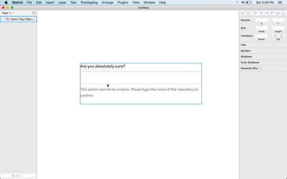
For developer: Pick from the docs and pick your props
The benefit of this is two fold:
a) Productivity: You don’t have to replicate the decisions of the designer, that’s already taken care in the system
b) Trust/Authority: The team knows if this comes from the system, this is pre-approved by the design team, they won’t spend time in review.
We experimented a bit with the idea of being able to generate a sketch library from React components and got to 95% but the last mile was hard and filled with snakes.
So for now, someone has to manually update the library with every release (very difficult, right now we update it once a month)
I want to spend some time with Figma and Framer to see if this would be easier to do.
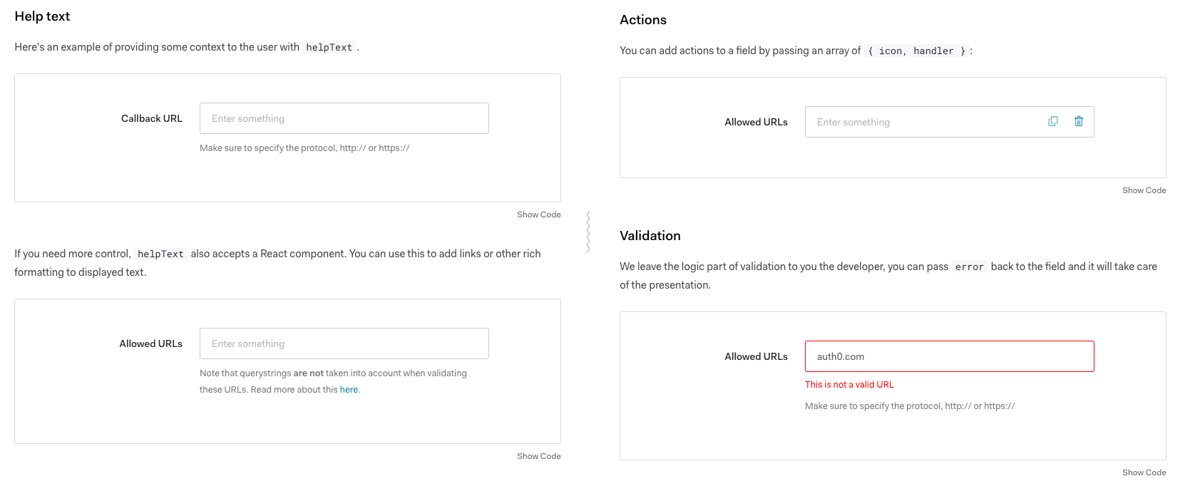
4. Documentation
This is the only non-negotiable piece of your system. No matter how you slice that diagram, you will need to document it properly otherwise folks won’t use it.
The documentation needs to not only tell the user what they can do with the system, but also guide the user’s choice.
A good design system should also have design guidelines (right now ours are distributed on google docs and dropbox paper), voice and tone (we don’t have concrete guidelines as of now) and accessibility guidelines (err…)
Another design systems sin: Our components are neither responsive nor accessible. This is obviously terrible, if the building blocks are not responsive + accessible, your products can’t be either.
This was one of the harder calls for us, but here’s our thought: If our immediate users don’t mind, we’re going to run with it and build something that suits their current needs.
I’m not super proud of this decisions because it hurts the end users - real people who use our products even if the developers in between don’t mind.
Good news: HTML elements are responsive and accessible by default, so we didn’t break everything and now when we fully implement a component and make it responsive inside it’s container, the product get’s it for free. Accessibility is slightly more involved where we need contextual input from our users.
Final words
Do what works for you. You don’t have to follow all the advice you read on blog posts. Be conscious about tradeoffs you make and fix them in time.
Hope that was helpful on your journey!
Sid