When I started working on cosmos, I didn’t think spacing is a big deal. Just add some padding and margins to your component and it looks good.
Let’s take the example of a heading, it should look the same throughout our application, so let’s create a Heading component and keep re-using it.

h1.heading {
  font-size: 36px;
  color: #222;
  margin: 36px 0;
}
A heading usually means beginning of a new section, so adding a lot of margin should make sense.

Looks okay, right?
Well, not always. This was quickly challenged when we started building complex compounds like this one:

It’s the same Heading component but it doesn’t have any top margin because there’s a breadcrumb sticking to it. Let’s treat that as an exception, we can override it and move on with our lives.
.page-header .heading {
  margin-top: 0;
}
And in case you’re interested, here’s what the React part would like:
const PageHeader = (props) => {
  return (
    <div>
      <Breadcrumb href="/home" icon="arrow-left">
        Back to applications
      </Breadcrumb>

      <Stack>
        <Heading>Clients</Heading>

        <ButtonGroup>
          <Button icon="play" appearance="secondary">Tutorial</Button>
          <Button icon="plus" appearance="primary">Create client</Button>
        </ButtonGroup>
      <Stack>
    </div>
   )
}
Great, moving on…
Here’s another one with a completely different margin this time. 🤦♀️
Should we override this as well?

.application-card h1 {
  margin-top: 16px;
  margin-bottom: 16px;
}
Okay, clearly there’s a pattern here. The heading has consistent styling in all these examples (font-size, color) but different margin requirements.
Here’s a safe generalisation:
Each complex component has to decide how to position it’s children relative to each other.
So that’s sorted, kind of. There are 2 problems to talk about here:
- If each complex component starts adding whatever margin feels right (4px, 9.5px, 73px), we might lose the consistent feel we want.
- What happens when the Heading component changes, maybe we increase the margin, change it from a
h1toh2, some of those overrides will break. Can we keep track of which components use it and did we break them?
Let’s tackle these problems one by one.
1. What margin should I add?
Your goal is to keep vertical spaces between elements on a page consistent with each other. This is where the concept of vertical rhythm comes in.

This doesn’t mean you are allowed to use only one margin value throughout. Instead, it means the margin values should be:
- Consistent across the app: 2 paragraphs should always have the same spacing between them.
- Consistent with each other: Spacing between heading and the first paragraph should be compatible with the spacing between the paragraphs.
When all of your measurements follow the same rules, you automatically get a more consistent UI.
You can do that by adopting a grid system. The 8pt system is probably the most popular one and the one we use (with px)
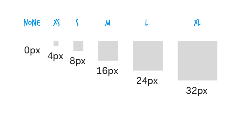
Now instead of talking about spacing in pixels, you talk about it in terms of spacing size or spacing token. The difference between consecutive sizes are intentionally big, forcing you to pick a side instead of trying to make it look good by hit and trial.
There’s no specific reason to pick t-shirt sizes as names, it’s just easy to reference them. Imagine asking your designer: Should this component have a small margin or an extra small margin?
Let’s go back to our components and use these tokens, shall we?
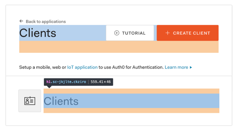
h1.heading {
  margin: $spacing-xl $spacing-none;
}
.page-header h1 {
  margin-top: $spacing-none;
}
.application-card .heading {
  margin-top: $spacing-m;
  margin-bottom: $spacing-m;
}
Much better!
This solves the first problem, on to the next one now.
2. How do I make my margins maintainable?
In the above examples, complex components are overriding the default margin of the Heading when needed. What happens when this default changes from $spacing-xl to $spacing-l?
One of the above 2 components would break while the other is just fine 🤔. Some of these visual changes might be easy to track while others might be too subtle, This isn’t predictable at all!
It looks like the Heading cannot control it’s own margin, instead each complex component has to decide how to position it’s children relative to each other.
Let’s make that a rule:
A reusable component should not have margin or any other positioning property (like float).
Now, you won’t have to override a component just to add margin: 0. However, it does create extra work in cases where the default margin would have been perfect. Adding a little boilerplate in exchange for predictability is a good tradeoff.
The other problem is that the overrides depend on the output (or implementation detail) of the Heading component -
/*
  Page header uses the h1 element to override,
  the Heading implementation might change to h2
*/
.page-header h1 {
}

/*
  Application card uses the class name to override,
  which is better, but still risky as it can change.s
*/
.application-card .heading {
}
Both of these code snippets get the job done but aren’t reliable because they depend on the implementation detail.
Don’t get me wrong, it’s a perfectly valid approach if your project is built with good old HTML + CSS. You have to make a commitment not to change the implementation details because it will break the places this component is used. Popular CSS frameworks (like bootstrap) work like this and do a brilliant job.
When you want to make major changes, you can either create a new component or track them with visual tests so that you can update them without breaking.
If you’re using React, you are working with a higher layer of abstraction - Component. This gives you the luxury of changing the implementation details without changing it’s usage.
Unless of course, you let folks use the implementation details for overrides, then you’re stuck.
There are multiple strategies that can work, so I asked the experts for advice.

You can read all the replies to the tweet here. Here are the few patterns that were more popular than others:
A. Margin-wrapper components
These are helper components that are built specifically to add margin around other components.
.application-card .heading-wrapper {
  margin-top: $spacing-m;
  margin-bottom: $spacing-m;
}
By using a wrapper, you are not dependent on what’s inside of it. Even if the implementation detail of the Heading changes, it wouldn’t affect your margin.
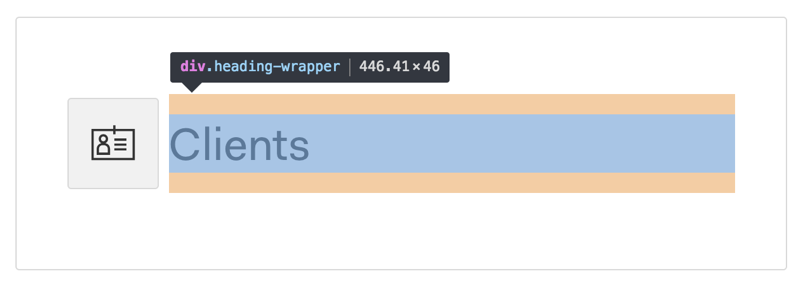
const ApplicationCard = props => {
  return (
    <div className="heading-wrapper">
      <Heading>Clients</Heading>
    </div>
  )
}

/*
 You can take this further and create a
 reusable wrapper component that accepts
 a spacing token as prop
*/

const ApplicationCard = props => {
  return (
    <MarginWrapper size="m">
      <Heading>Clients</Heading>
    </MarginWrapper>
  )
}
B. Spacer component
I was surprised by how popular this one is. The idea is to use a component that takes space but has no visible content (either with height or margin).
You can create a pretty expressive API for yourself.

const ApplicationCard = (props) => {
  return (
    <Spacer size="m">
    <Heading>Clients</Heading>
    <Spacer size="m">
  )
}
C. Margin prop
The one that appealed to me most was adding a utility-style margin prop on the component, here’s what the API looks like:
const ApplicationCard = props => {
  return <Heading margin="m">Clients</Heading>
}
You can guess what this does, it adds a margin of size spacing-m to the component. (It uses class names to do this, no inline styles over here)
In case you need a different top and bottom margin, you can pass an object instead.
<Heading
  margin={{
    top: 'm',
    bottom: 's'
  }}
>
  Clients
</Heading>
The things that clicked about this pattern was:
- The overrides are on attached to the component itself which makes it easier to track.
- Prop types validation! You can warn users when they use in ways that you don’t want.
- Does not add additional divs (sometimes extra divs can hurt you, example: in a table)
- The ability to add test cases for each of the supported values to make sure they don’t break when the implementation details changes.
If you’re curious, I wrote a long form proposal with a sample implementation on the cosmos repo: cosmos/pull/1059
If you’re even more curious, you should check out styled-system by Brent Jackson (and 46 contributors) which makes style props based on themes/tokens accessible.
Congrats! You’ve made it to the end! Spacing isn’t as trivial as it looks on the surface, does it? 😅
Now if you’re holding your head in dismay and thinking you don’t need all this work, that’s okay, you probably don’t. If you find yourself in a similar situation in the future where you have to build a bunch of robust reusable components, think of this post 😉
Hope this was useful on your journey!
Sid
Thanks to all the folks who contributed on the twitter thread: Jenn, Diana, Sarah, Abhinit, Adam, Alison, Andres, Andrey, Aneth, Björn, Brett, Chris Biscardi, Chris Villa, Christopher, Darin, Julio, Kamlesh, Kiran, Kuldeep, Kushagra, Mike, Micheal, Nate, Narendra, Ritesh, Ryn aaaaaaand Wessley